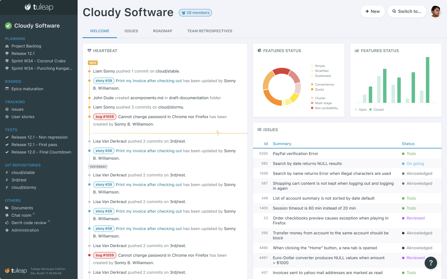
In order to improve the day to day use of Tuleap for regular users but also to improve the onboarding of newcomers, the global interface of Tuleap has been reworked.
No more navbar
The white navbar is replaced by floating buttons: "New", "Switch to", "User" and "Help".
New sidebar
Still a WIP, the idea is to remove the navigation by services. No more 3 or 4 clicks to access to project backlog, kanbans, trackers, git repositories…
