•  
      request #27566 Tuleap Skin improvements (as of Tuleap 13.11)
    Infos
    #27566
    Manuel Vacelet (vaceletm)
    2022-09-15 09:57
    2022-07-19 17:01
    29130
    Details
    Tuleap Skin improvements (as of Tuleap 13.11)

    The goal of this request is to capture the things to improve on Tuleap Skin based on the state released in Tuleap 13.11.
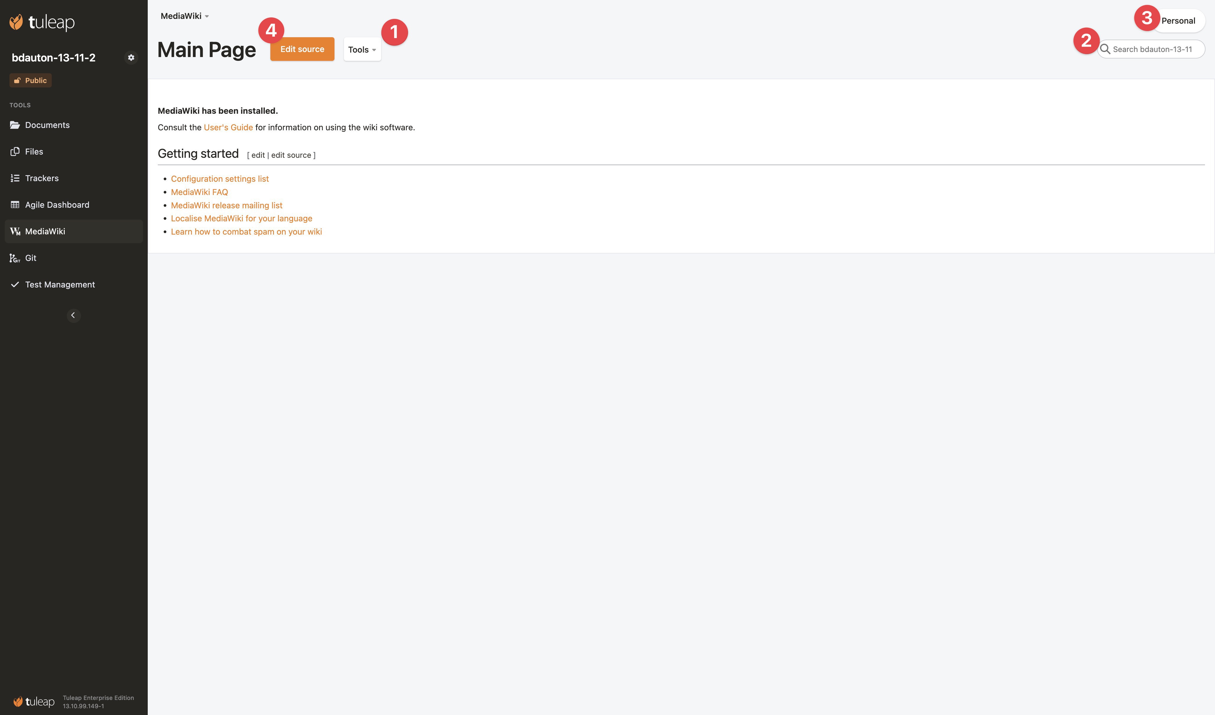
    2433-1.jpg

    1. Tools button:
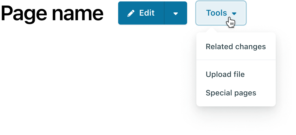
      • Dropdowns should appear on click, not on hover
      • I suggest to reorganize actions in two dropdowns:
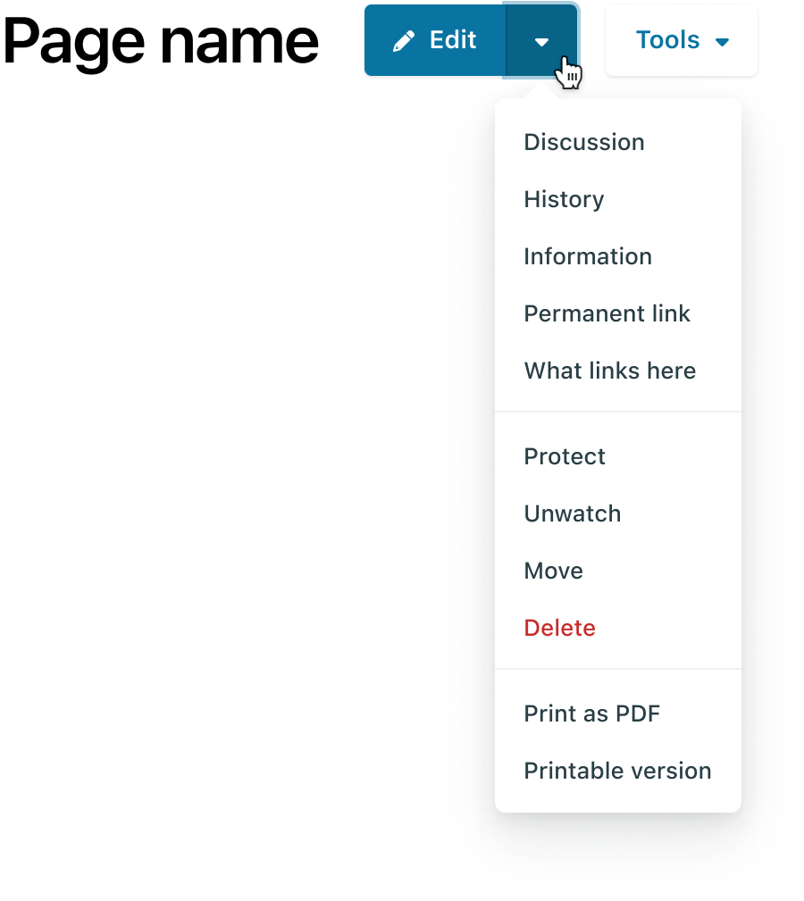
        2440-edit-dropdown.png2441-tools-dorpdown.png
    2. Search field:
      • The field should look like the one in the TLP documentation (placeholder color, icon size…). See the differences:
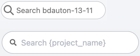
        2442-searchfield.jpg
    3. Personal button:
      • The label is misleading. Maybe we should rename it to "MediaWiki Account"
    4. Edit source button
      • Is it possible to "hide" the old editor and provide only the visual editor? If yes, on click on the "Edit" button, user will be redirected to the visual editor. We can also remove the "Edit" item in the dropdown.
      • One have to click exactly on the text, if the click happen on the color part of the button, it doesn't switch to edit page.
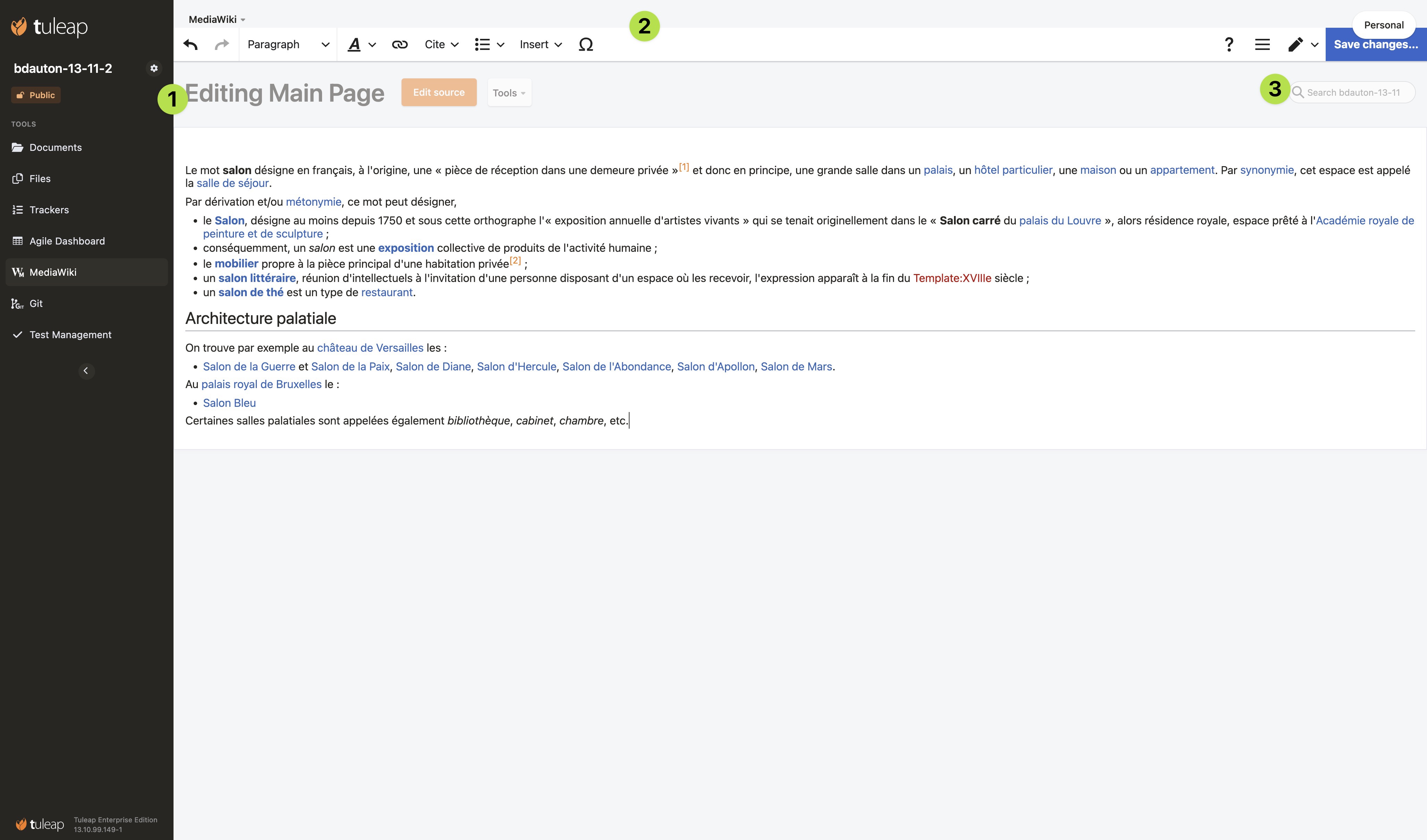
     

    2438-2.jpg

    1. Page title during the edition shouldn't be dimmed and the Edit source, Tools and Search field (3.) components should be removed
    2. Edit toolbar:
      • When it's not sticky to the top of the page, it should be placed at the beginning of the white area, just before the page content 
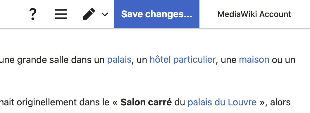
      • To avoid overlap between "MediaWiki Account" and "Save chances" buttons:
        • The toolbar should have a sufficient right padding so the "Save changes" button will be at the left of "Mediawiki Account" button on scroll
        • When the toolbar is sticky, the "MediaWiki Account" button should not have shadows anymore:
          2439-screenshot%202022-07-20%2011.47.29.jpg


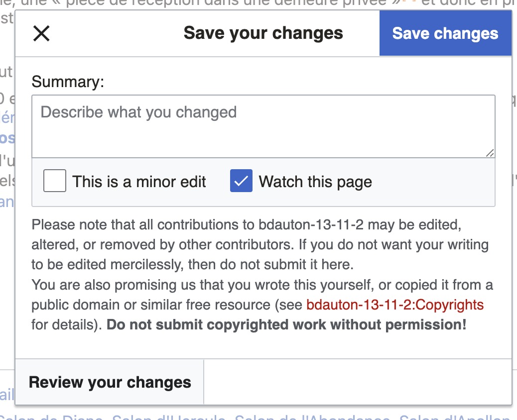
    Last point : MediaWiki UI elements like modals, buttons, checkboxes still have the MediaWiki skin applied. I wonder if it would be hard to apply the TLP style to these elements and at what cost.
    2443-mw_modal.jpg

    Mediawiki Standalone
    Empty
    Empty
    • [ ] enhancement
    • [ ] internal improvement
    Robert Vogel (rvogel), Miriam Schlindwein (mschlindwein)
    Stage
    Empty
    Closed
    2022-09-15
    Attachments
    References
    Referencing request #27566
    Referenced by request #27566

    Follow-ups

    User avatar

    Hello,

    I checked the global MW style on Tuleap 13.12.99.85. Here are some points to fix:

    1. Breadcrumb must look like the breadcrumb in Tuleap
    2. The search field should look like the standard TLP search field, not the small one:

      height: var(--tlp-form-element-height);
      padding: 0 15px 0 33px;
      background-position: 13px center;

    3. Tools button: left and right padding should be var(--tlp-medium-spacing)
    4. .title-section bottom padding should be var(--tlp-medium-spacing)
    5. Edit toolbar:
      1. There should be no left and right margins
      2. Please apply these two changes: border: 0; box-shadow: var(--tlp-sticky-header-shadow);
    6. "Save changes…" button should look like a disable button when it's disable:

      border-color: transparent;
      background: var(--tlp-main-color-lighter-30);
      color: var(--tlp-white-color-transparent-40);

    7. Favicon color must be theme dependent (also in page edition mode)


    User avatar

    1.Tools button : fixed opening up on click, also reorganize in two dropdowns 2. Search field: fixed styling of search field 3. Personal button: changed label 4. Edit source button: fixed clicking button colored area 5. Changed position title area in edit mode, hide buttons during edit mode 6 Edit toolbar: repositioned toolbar, also set padding for mediawiki account button

    About the questions:

    • Is it possible to "hide" the old editor and provide only the visual editor? If yes, on click on the "Edit" button, user will be redirected to the visual editor. We can also remove the "Edit" item in the dropdown.

    I am not sure if I understand fully what is meant with old editor. In visual editor there are two options to edit text: visual mode and source mode for wikitext. So these options are intended and its recommended to allow both. Also on pages like MediaWiki:Common.css you will need the "old editor" to edit wikitext - therefore I would recommend to keep all editors. But I changed the link for edit button to open up in visual mode directly if its avaibable - so maybe this solves it for you.

    • Last point : MediaWiki UI elements like modals, buttons, checkboxes still have the MediaWiki skin applied. I wonder if it would be hard to apply the TLP style to these elements and at what cost.

    This change would come with high costs because there is no easy accesspoint to change the styling ( there is currently no intended way ) so it would be high effort to change all stylings.

    User avatar