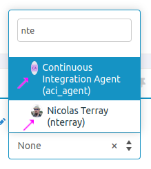
When the ListPicker is small, the avatars are shrinked:

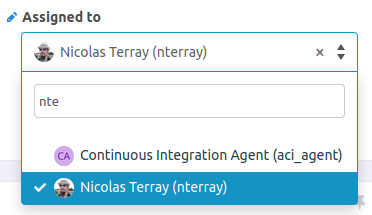
But once you select a value, its size changes and avatars are ok:

It is probably linked, but on this tracker Severity ListPicker is much bigger than necessary and choosing a value for Category forces reflow:

versus:

This is a little bit disturbing to give plenty of space for Severity (Ordinary/Major/Critical) and not for Category.