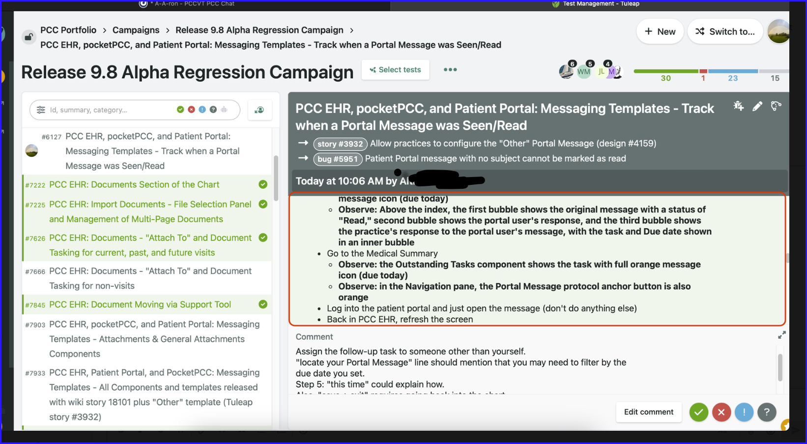
As a user performing testing within a Tuleap campaign
I want more space to see the testing steps
So that I don't have to scroll so much to complete a test scenario
Right now, if the name of the test scenario is long (takes up 2 lines) and there have been bugs opened against the test execution (2 or more lines), and the execution has a comment on it, there is not a lot of screen real estate for the actual test steps. Users are only able to see ~10 lines of text. This makes following a procedure difficult. We would expect there to be a way to see more lines at once. Ideas we have tossed around would be:
- Making the test execution selection on the left side collapsible
- Allowing users to resize the ratio between the text execution selection side and the test execution steps side
- Allowing for collapsing of the logged bugs against the execution.
- Allowing for collapsing of the comment field
- Moving the comment field to the right entirely like follow-up comments are in modal view for artifacts

For reference, the screenshot above was taken on a Mac with a 14" screen, resolution of 3024x1984.